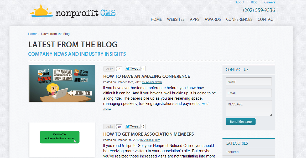
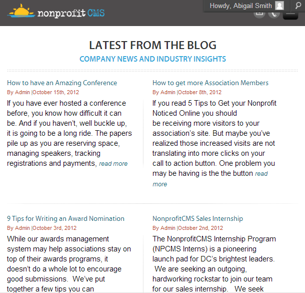
Most likely you are not a web designer, and neither am I, so let’s not get into the technical jargon. Let’s talk about what responsive web design means for you and your association. In a word, an opportunity. Think about your own experience with the internet. You are out to lunch with a colleague, and he recommends some company. So, you grab your phone and attempt to pull up their website. If it is hard to navigate on your small screen, you’ll probably say to yourself, “Oh well, I will check it out on my computer later.” But how often do you remember to do that? If you are like me, never. Responsive design will make everything fit the screen naturally, meaning when someone visits your site, they will find what they are looking for faster. This will bring you more members, contributors, award nominations, or anything else your website calls for.
If you are still confused about responsive design and are reading this on a computer, you can check it out for yourself. With this page open, pull the internet browser smaller and bigger and you will see the content adjust. Cool, right?
Just a year ago this wasn’t a thing. People viewing websites online would either be looking at a mobile version (which did not contain all the options), or they would be scrolling around on a small-print, full site squinting to see the menus and easily hitting the wrong buttons. In 2011 Ethan Marcotte came up with responsive design, and it has exploded ever since.
But mobile sites fit the screens, so why aren’t they enough? Two big reasons: SEO (search engine optimization) and cost. In terms of SEO, having one site avoids multiple content filters–this is considered best practice. And now consider cost; it shouldn’t come as a surprise that having both a standard site and a mobile site will cost more. If you have two sites, you have to pay in money and time for the development of both.
The important thing to realize about responsive web design is that it isn’t just a fad, it is the real deal. As smart phones, tablets, and other devices have become popular, so has using them for the web. You could be losing many leads this way. If someone does hear about your association while out to lunch, you want the first contact to be successful so they remember you and return. As I mentioned in How to Get More Association Members, it will take more than one visit for people to take action.
Responsive design is also somewhat “future proof”. We see new mobile devices coming out constantly. The latest iPhone has a new screen size–that’s no problem for responsive design. Who knows what the future holds for sizes and shapes of devices we’ll get the internet on. You certainly don’t want to be left behind as new technology develops.
The take-home point: If you are looking for competitive advantage (which you always should be), go with responsive design.


