Websites are not built by the people who routinely use the website, but by the nonprofit or company who owns the site itself. This disconnect can create frustration for visitors and site owners alike. In this post we will share a lesson learned on correcting headings and images to help keep users engaged with a website longer.
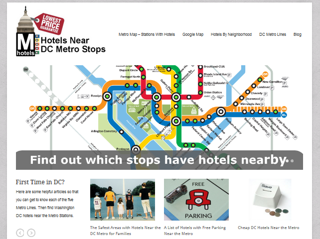
We recently worked with a website that strictly focuses on profiling hotels near dc metro stations. The website’s homepage like many other homepages has two large images that slide back and forth in an attempt to keep users at the site, send a message and capture their attention.
In this case the homepage has two sets of images (new homepage above). Before our changes the old homepage used the sliders below when visitors arrived. And below the large homepage images was a set of smaller images that used snippets of the metro map. Those images pointed to articles about each metro line. Guess which group of images was clicked on more often? The images boasting about the site, or the snippets of the metro map?
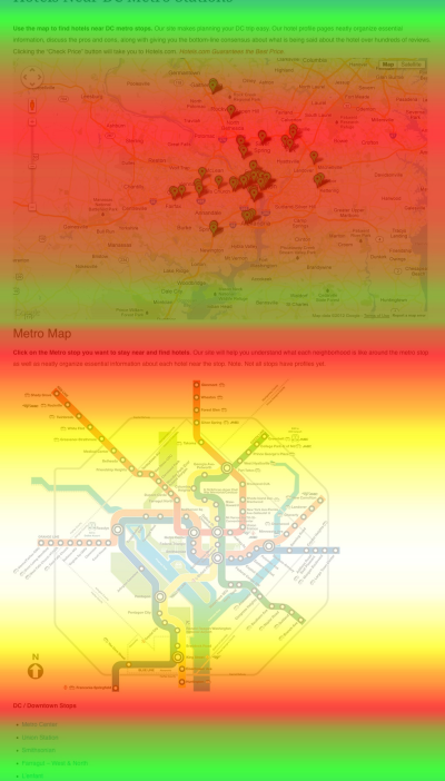
Hands down the images of the metro map where always clicked more than the large images of the child and slam dunk. Furthermore, other click tracking studies around the site demonstrate the metro map was one of the most viewed areas of each page, even more popular than a Google Map pin pointing hotels.
The website owner made the assumption visitors would want to know why the website was helpful over providing the visitors with the information they wanted most. In the case of this site 90% of all visitors arrive through search engines and usually include “dc metro” and “hotel” in their search. It’s not practical to assume the user knows which hotel they want, or what area they desire to stay in. So a visitor needs to start somewhere and the best place as voted by the visitors was the metro map.
The website thus changed the homepage to incorporated a larger metro map which clearly points out which stations have hotels. This map was also placed on nearly every page. The bounce rate, and average time on site improved by double digits.
While this post might sound completely obvious, consider putting yourself in the shoes of the site owner. The team worked week after week to produce a clean easy to use site about Washington dc hotels near the metro. The homepage images were one of the last items to be implemented on the site. After weeks on end of building the site, of course, the site owner thinks their site is the best, and subsequently they thought it was best to say so on the homepage. Users, however thought differently and didn’t care. They wanted the information they were looking for as fast as possible, the boasting only got in the way.
Here are the takeaways from this lesson:
- Always match the images and headings of every page on your site with the user intent. For instance, nonprofits websites should quickly demonstrate their page shares the values of its visitors and avoid soliciting for donations or registration too quickly.
- Always pay attention to what keywords are being used to arrive at your website’s homepage or other popular top landing pages and match the intention of that keyword search with the heading of your page.
- Chances are your team is too close to the website to make a fair judgment. Always hold subjective opinions accountable to users actions measured by click tracking tools.


