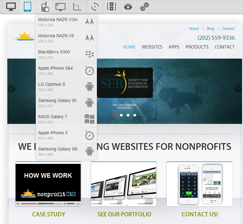
We just came across a great tool and wanted to share! Responsive design, at least in theory, means a website can reformat itself to make optimal use of the current screen size. Before it was easy — iPhone, iPad, desktop. Now that the Android has become so popular and netbooks are everywhere — there are so many sizes to test and confirm.
Check out Screenfly — a free service: https://quirktools.com/screenfly/
iPad view + View Switcher
iPhone 3/4


