Among the various factors influencing website design in 2013, the prevalence of multiple viewing devices ranks as one of the most important innovations that the industry needs to quickly adapt to. The ubiquity of smartphones and tablets has forced web developers to pay attention to how their websites are displayed on various screen sizes and be attentive to the compatibility between the web development technology and portable communications technology like android and IOS.
What are some changes Website Developers adopted to respond to this change?
With increasing number of individuals choose to access websites via their mobile devices and tablets, websites are built to be “Responsive”, a web design approach aimed at crafting sites to provide an optimal viewing experience across a wide range of devices. Another key example is what I like to call, “The Death of Flash.” Flash is not supported by most smartphone operating systems, and web developers have been eliminating the use of flash when building websites for a better user experience. Lastly, the debate over skeuomorphism and flat design, a contention popularly discussed among application and interface designers, has grasped the attention of Web Developers and Designers.
What is Skeuomorphism?
In order to understand this debate and how it affects web design, defining the terms is imperative. Skeuomorphism is a physical ornament or design on an object made to resemble another material or technique.
Here are some examples of Skeuomorphism:
What is Flat Design?
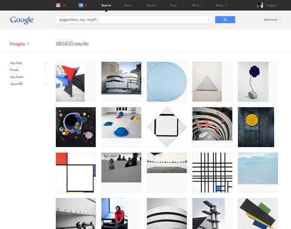
Flat Design is a technique in which designers use very limited or no effects when creating a design scheme, thus creating a design concept that lacks the three dimensional feel and just rests on the screen. Here are some examples of flat design:
Skeuomorphism vs Flat Design
This debate has been manifested through products of the two largest smartphone software companies – Apple’s IOS and Google’s Android. Apple’s iOS, being arguably the first popularly used smartphone, embraced skeuomorphism. For the general public who were new to the smartphone technology, skeuomorphism was a more intuitive interface. There was no guessing how to use the functionalities of the phone, because it looked and worked just like the real thing. However, Google decided to take on a much simpler and cleaner approach to interface design by incorporating flat design. The flat design interface has allowed content providers to use screen real estate more efficiently, and the big flat polygon buttons made the use of touch screen easier.
As more people are accessing websites via smartphones and tablets, this debate has become applicable to web designers as well. If you have been paying attention, you might have noticed some major websites, like Microsoft and facebook, have embraced the flat design and made the transition already. Microsoft took a step further and have flattened not only their website but all of their software interface, too.
With the release of IOS7, even Apple has moved closer to a flat design approach. However, as web developers, we need to really think about the pros and cons between the two design paradigms rather than blindly follow a trend. Skeuomorphism’s intuitiveness is a quality that we cherish and need when designing website. Familiarity is often at the center of good user experience designs. However, with the emergence of multiple viewing devices, flat design has been recognized for its compatibility with touch screen technology and flexibility in conforming to various screen sizes. These are all qualities we cannot forego easily, and how we implement the two design schemes to our websites will be a challenge all web developers will have to overcome.

